Cheeky Panda is a purpose-driven B Corp company on a mission to make everyday essentials sustainable.
Founded in 2016 by married duo Julie Chen and Chris Forbes, the brand creates bamboo toilet paper, kitchen roll, straws, nappies, and more — all designed to be kinder to the planet without compromising on quality or softness.
It was Chen who spotted the problem to solve: eco tissue products were either poor in quality, or so dull in branding that they couldn’t connect with customers. And nearly 2 million trees are cut down every day for tissue paper — trees that take decades to grow, just for something we use in seconds.
Enter bamboo: it grows rapidly, renews itself naturally, and doesn’t need replanting. Cheeky Panda set out to prove that going eco doesn’t mean rough or basic, their silky-soft toilet paper is designed to feel high quality and luxurious.
Cheeky Panda proves that eco-friendly brands don’t have to be serious or preachy.
Their rebrand turns sustainability into something fun, playful, and inviting, encouraging shoppers to get involved and support climate-positive choices.
The company’s commitment to sustainability runs deep, including their use of biodegradable and plastic-free packaging.
Backed by B Corp certification and genuine purpose, this isn’t just marketing - it’s mission-driven storytelling done with charm and confidence.
Cheeky Panda has always had a playful personality, and the refresh leans into it even more.
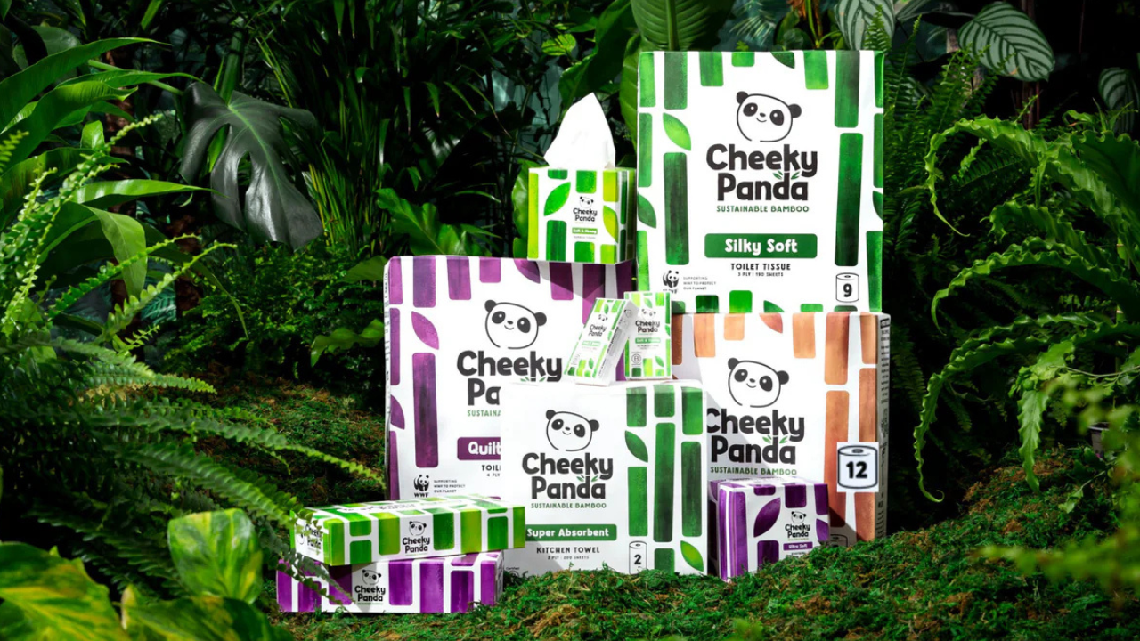
Their logo, Colin the Panda, gets a major glow up - he’s cheeky, proud and 100% unmistakable.
He’s not just a cute design, he’s a strategic brand asset that creates an emotional connection with customers. He gives Cheeky Panda a voice that stands out in a crowded space - the perfect mascot to carry the brand into new categories and markets.
Sustainability doesn’t have to be just green anymore. Cheeky Panda’s bold, vibrant colours catch the eye immediately.
The colour palette signals energy, optimism and fun, aligning perfectly with the brand’s personality.
On-shelf visibility is everything - and their branding pops against competitors, easily spottable from across the aisle.
Clarity is a huge competitive advantage.
The simple messaging makes the brand’s mission instantly understandable. A bolder logotype now pairs with the clear tagline “Sustainable Bamboo,” ensuring shoppers immediately know what the brand stands for.
With two simple words - ‘silky soft’ - they communicate that their products do not compromise on quality and comfort.
Through simple messaging, Cheeky Panda captures consumer attention, communicates the product’s core benefits and purpose, and triggers people to buy.
The new design celebrates bamboo, taking an illustrative approach that softens the look of the bamboo. No more spiky sticks - just softer, natural bamboo that reflects the silky-soft texture of their products.
It’s design with purpose: communicating sustainability while keeping the packaging playful and tactile.
The refresh gives Cheeky Panda a bolder, more confident tone of voice. Every element - from Colin the Panda to the logotype to the bamboo illustration - works together to tell a clear story: Cheeky Panda is a major challenger in the toilet paper market, offering sustainable products without compromising on softness or quality.
Their playful, confident story connects with shoppers in a way that makes them smile.
Cheeky Panda’s rebrand is a masterclass in how purpose-driven brands can be fun, bold and commercially ambitious.
It’s more than just a visual update — it’s a statement that sustainability, storytelling, and personality can coexist, creating a brand that’s recognisable and ready to take on the world.
Now it’s time to take action - connect with Cheeky Panda and support this incredible company: Website | Instagram | LinkedIn | TikTok